How to write a photo essay

This week, the hallway track was where I learnt how to write a photo essay!

The hallway track is one of my favourite places at conferences and seminars. It helps my business with “lead generation”, and who doesn’t want a bit of “lead generation” when you’re running a business?

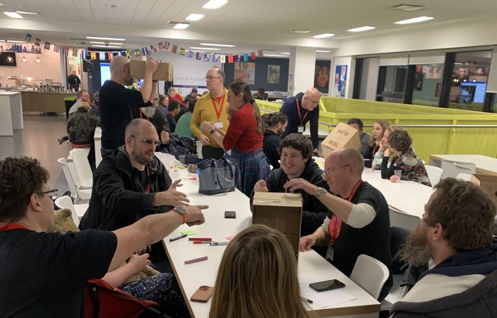
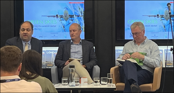
A hallway track is the collection of gaps in the proceedings at big conferences and at small events, a place where you have a chance to chat with people, to shoot the breeze, and to explore conversations that you might not ordinarily have had in your daily working life. That happened to me this week, when I went to an event run by the London Chamber of Commerce & Industry (LCCI) to celebrate the achievements of The Royal Photographic Society (RPS).

As a result, this blogpost is a bit of a double whammy! This article is an overview of what I learnt at the LCCI event and then there’s a link at the end, to a full blown example of what I learnt, how to write a photo essay.

Objective

Do you have one or more objectives when you go to business events?

I do. In brief:

• Meet some new people
• Get some business cards
• Learn something new
• Follow up

It doesn’t always work like that, though this week I was able to tick every item on the list. It helps to do a little advance preparation. In my mind I had already likened photography to art, and so I quickly checked my library of quotable quotes to see who has said what about art. Just in case I needed to kick start a conversation with some relevant material. I found a quote from Aristotle and another from Tolstoy.

Aristotle: “the aim of art is to represent not the outward appearance of things, but their inward significance.”

Tolstoy: “the main purpose of art is that it tell the truth about the soul, revealing and giving expression to all the secrets that one cannot say in simple words – art is a microscope that the artist focuses on the secrets of his own soul, and that then reveals to men the secrets common to them all.”

Photos are a form of art, so I thought that I had a reasonable foundation before I arrived at the LCCI venue. In the event, I didn’t use any of the prepared material, as my customary open ended questions turned out to be more than sufficient.

Converse

The formal presentations were predictable, and lasted around 30 minutes. The hallway track before and after was very illuminating. I was talking to Mark Phillips who is the chair of the RPS Documentary Group, and my normal conversations start with something like “so tell me, why is X so important” or “what’s the thing you’re most proud of” or in this case (with my art quotes mentally prepared) I said “how do I judge the significance of a photo”.

Mark was very enthusiastic about lots of things, and he gave me the big “golden nugget” of the day. Normally at every event there’s a golden nugget, if you go and look for it.

That’s one of my other stock questions for events . . . in the group networking after the formal presentations have ended I will often ask “what was the one big thing that stood out from that talk”. Try it, you might be surprised that half the time your counterpart will reply “I dunno”.

And half of half the time, I agree with them! The speakers really didn’t say much at all. The other half of half the time I ask myself if the delegate was really listening. This week I was listening carefully (as usual), and Simon Hill (President of the RPS) did have something valuable to say. He told us about London’s heritage with a focus on trade and shopkeepers. That tied in with the photo exhibition which is on display at the LCCI Queen Street venue for one month.

Anyway, the golden nugget was Mark telling me about Life magazine and Time magazine, and how they had an “Eight Photo” guidance document on how to prepare a photo essay for publication. It’s guidance, it’s not a strict formula, and it was clearly the right way to handle articles in paper magazines in the pre internet era. There’s a lot of value in it still, and in order to demonstrate that I have dived in head first and prepared an “Eight Photo” essay on my experience of Stirling University.

That comes a bit later! I prepared it because (a) I liked the idea of an essay formula (though it’s not a strict formula) and (b) I wanted to have the experience of doing one for myself and (c) it ties in neatly with my fourth objective which says I have to follow up!

In summary the eight photographs recommended by the magazines are:

• Overview – typically wide-angle giving comprehensive impression
• Medium Shot – focussed on activity or a group
• Close-up – spotlighting one element, or detail
• Interaction – humans element, talking or activity
• Portrait – strong image, or key protagonist or character
• Signature Image – synthesis that tells whole story in one image
• Series –show how something happens, inject pace or convey action
• The Clincher – often a close-up to close the series

My outline preparation looked like this, before I even started thinking about adding the dialogue:

a grey scale composite image of 8 small photos labelled from Overview to Clincher illustrating life at Stirling University

Follow Up

How do you follow up a business meeting? Especially one where nobody is pressing you to do a follow up?

Send some thank you letters or emails. And write a blogpost. In my case I also add some notes to my company knowledge base. This week the knowledge base has a new section entitled “photo essay” and as a result of that new information, the section entitled “blogpost” has also been tweaked a little.

Then email some more people, and tell them what you learnt and what you’ve blogged!

“University” was an apt choice for my photo essay, because my son is now in the final stages of his journey through university, and it brought back memories of my own. And, having completed his final essay, my son shared with me a quotable quote from his conclusion. It recognises that some people feel they can’t start a conversation, or they can’t make the most of the hallway track, or they can’t begin writing a blogpost or a photo essay.

How to Actually Start the Task You’ve Been Avoiding

Bregman: “the biggest challenge to moving forward on anything is the transition to working on it. It almost always represents a shift from doing something comfortable to doing something uncomfortable”.

Bregman’s article in the Harvard Business Review helps with that, so does Checkland, and so does Descartes.

Bregman’s details have been added to my library of quotable quotes which is on my own knowledge base. That’s one of the tools that help my clients, firstly you need a business plan, then secondly a knowledge base, and thirdly a team which helps the business grow. Checkland has retired. Descartes is dead. Is this knowledge base something that I could help you with?

By the way, here’s my article A Stirling University Photo Essay which helps illustrate how I interpret the advice I was given this week.

22 March 2024 edit

And (eleven months after this blogpost was written) here’s an example of The Guardian newspaper doing a modern photo essay online. They’ve used a lot more photos, but the principle eight are the larger ones as you scroll down the page. It seems that the extra ones are often clustered into small groups of four. However, the principle eight can still be clearly identified, and they fit the style guide used by Life magazine and Time magazine.

a grey scale composite image of 8 small photos labelled from Overview to Clincher illustrating life at New Convent Garden Market=

The Guardian: Night time in New Covent Garden market – a photo essay

A Eurovision Song Contest ServQual

ServQual is a system for measuring things which cannot be measured.

Actually, it’s for measuring things which are difficult to measure because they do not fit neatly onto an ordinal scale. For example, it’s not easy to say that “this school uniform policy scores 7 out of 10”, or to score the standard of the service in your local supermarket, or to judge the quality of a song in the Eurovision Song Contest. What one person thinks is “7 out of 10” is not always the same as what somebody else thinks.

If only there was a consistent way to measure this stuff . . .

Firstly, let’s explore what ServQual does, and then work on the example of the Eurovision Song Contest.

How ServQual Works

The common element of evaluation systems that try to measure these things will often have tick boxes like this:

strongly disagree disagree slightly disagree neutral slightly agree agree strongly agree

And, what’s the difference between an “agree” and a “strongly agree”? Is a “strongly agree” worth twice the value of an “agree”?

There are seven boxes at the top of the sheet, should they be numbered 1 to 7 in turn? Is that 1 to 7 measurement really a fair representation of the sentiment? Is “neutral” really worth 4? What’s the solution?

The ServQual methodology provides a way in which users can evaluate services and products when the “value” is hard to measure

During the 1990s a joint venture (backed by UK Government NHS funding) involved PhD students in pharmacology at the Lahore Institute of Quality & Technology Management and PhD students at the University of Stirling. They built an evaluation and measurement system for things which do not fit an ordinal scale. Representations of ticks or crosses on evaluation forms provided a simple heuristic review, what Nielsen calls a “does it look right” test.

Taking the “does it look right” test one step further, and by using the X2 test (the Chi squared test – measures of association on a non ordinal scale) the PhD students’ more detailed findings were relayed back to the governing bodies (in support of requests for more funding). For example, the researchers found that users valued sympathetic human contact, stating:

“we identified a wide gap in the perception of a ‘perfect’ receptionist and a ‘current’ receptionist, and now we need to do more research on how to make receptionists smile more.”

The PhD thesis added:

“Improving this single factor will lead to the biggest improvement in the ServQual score, and hence the biggest improvement in stress reduction (i.e. in patient happiness) in clinical encounters.”

If you’re interested in A Level statistics look up the X2 test (the Chi squared test), it is truly fascinating and enlightening for number geeks. The rest of us will just settle for Nielsen’s “does it look right” test.

The Eurovision Song Contest

Your job now, is to work out how to evaluate a song in the Eurovision Song Contest. The “public vote” is a gut reaction thing, but as an official judge you and your fellow judges will want to have a robust system for evaluating the quality of a song. Something that is true and fair and can stand up to scrutiny from your critics. Something that assigns the right degree of importance across a number of attributes. ServQual fits the bill.

What you need are a few “statements” which the judges can use as a basis for making their decisions. Something in the order of 8 to 12 statements is about right, and here are 4 to get you started. If you want to add yours to a word doc then you can download this basic proforma and add more detail.

In a perfect Eurovision Song Contest a perfect song would have:

1. a memorable melody, or tune, which you can remember and hum
2. a captivating first 10 seconds
3. a proportionate amount of canon fire
4. a touch of horror or shock tactics

In advance of the contest, each item is discussed by the panel of judges, and they may also be working with older ServQual docs form previous years. The judges collectively decide (for example) that “a captivating first 10 seconds” is rated a strongly agree and that “a touch of horror or shock tactics” is rated a disagree. We are talking here about a “perfect song”.

strongly disagree disagree slightly disagree neutral slightly agree agree strongly agree
1. a captivating first 10 seconds  


X

2. a touch of horror or shock tactics  


X

Half the job is done. They now have an indication of a perfect song in a perfect world (on a sheet with 8 to 12 statements). The next task is to score an individual song according to these statements, and they have a new, clean sheet with a blank matrix to help them do that.

In this particular case, this song has . . .

strongly disagree disagree slightly disagree neutral slightly agree agree strongly agree
1. a captivating first 10 seconds  


X

2. a touch of horror or shock tactics  


X

Once the “perfect song” and “this song” matrices have both been completed, a comparison can be made. The judges want to see a complete correlation in order to get a perfect song. With 8 to 12 statements it’s unlikely that anything will get to “perfection” but it could be close. The one with the closest correlation is the judges’ choice. Clearly with the examples above, the use of shock horror has moved this song away from the perfect song.

Number geeks may have already worked out that the judging sheets for Eurovision are then subjected to the X2 test (the Chi squared test) in order to get a scientific answer to the “correlation” issue.

And guess what? You can do this in business. Is your receptionist close to being a perfect receptionist, or way off target? Does your sales team get wonderful figures at the expense of upsetting customers? Do your managers manage effectively or simply annoy the staff? Is that why there are so many regular resignations and recruitment costs?

As Nielsen said “does it look right”? If you’re always getting one score way over on one side when it should be way over on the other side, then this is the statement that you should focus on most. Improving that one attribute will make the biggest improvement to your ServQual score. It’s basically the same whether you do the complex stats, or simply ask “does it look right”?

And that one thing wouldn’t happen to be time management would it?

Asking the wrong question

Today’s Sunday Times has a perfect example of “asking the wrong question”. The headline on the home page says . . .

“Firms beg Sunak: what’s the growth plan, PM?”

. . . and clicking through to the article gives you that exact same title. That’s not always the case with The Sunday Times, the article’s title can often differ from the headline on the home page.

Anyway, exactly who asked exactly what question?

screen shot of the news article

On closer inspection, business leaders are not actually asking about a plan. They already have a plan! Their plan includes “lobbying government for favourable treatment”. It’s the journalist that is playing the “click bait” game, providing a misleading heading, and spinning the facts to suit their own agenda.

Journalists like Sam Chambers are paid to incite clicks, which leads to you and me seeing adverts, which leads to advertisers placing business with news organisations, which leads to news organisations making money from advertisers. As a result, Sam Chambers gets paid, and theoretically, the news organisations make profits. There’s a whole separate debate about using “click bait” and another about the merits of placing adverts behind paywalls!

Disingenuously, Sam has started the article with a 15 month old story about Bill Gates (who has not asked Rishi Sunak “what’s the growth plan”). That story has a tenuous relationship to the thrust of today’s article. What the article says is that major blue chip companies are lobbying government for favourable treatment via legislation on tax and on immigration.

By and far the largest tool at the disposal of government is legislation. No matter what the agenda of the party in power, their only hope of implementing anything is to adjust legislation to incentivise (or to compel) individuals and businesses to behave in a certain way. Everything else is just window dressing.

Sam states that “start-ups are also being harmed by the legislative logjam” and cites the example of driverless trucks. The reason driverless cars (and trucks) are going nowhere is that they are dangerous. They still cannot handle weather patterns trickier than “partly cloudy”. There’s a thought provoking article about this on Bloomberg.

If the objective is to move goods, then moving goods in bulk using road trains consisting of a series of linked driverless trucks is a pretty inefficient and costly way to do what freight trains have been able to do since the early 1800s. More tellingly, the big tech firms like Waymo (Google) and Titan (Apple) have scaled back their self driving car ambitions. Anthony Levandowski, who pioneered the driverless car industry is now one of it’s most ardent detractors.

Change the statement “start-ups are also being harmed by the legislative logjam” to “entity A is being harmed by the absence of entity B” and you see how ridiculous that is. It’s like saying “population harmed by lack of Covid cure” when the more accurate statement is “population harmed by Coronavirus”.

Start-ups are not being harmed by anything other than their own conduct, and often that’s their own blinkered view of whatever product they want to foist onto an unsuspecting public. If their product fails to spark joy then they deserve to fail, and that’s typically what happens to about 95% of start-ups.

Sam’s article is little more than an exercise in bemoaning the ineffectiveness of the UK government. That’s not news! We all know that! What I wanted to know is which firms asked Sunak what questions?

“Urging” is not the same thing as “asking”.

Anyway, where is the growth plan? It’s a part of your business plan, a very large part, and you don’t need to ask the government about it (because they are incompetent), you need to read your own business plan and then you need to implement it. And if your business does not have a business plan then you need to ask yourself whether you should be trying to run a business in the first place.

infinite loop repeating plan do review

It all comes back to Peter Drucker’s advice “plan, do, review” and his quote “implementation is everything”. Here are a couple of questions to help your business succeed:

1. If there’s one thing you should be doing, but you’re not doing, what is that one thing?
2. What’s stopping you?

By addressing “what’s stopping you” you might decide to engage lobbyists to bring about changes to government legislation. And as part of that lobbying agenda, you might also slip a few quid to The Sunday Times to publicise your campaign. That’s all a part of a BigCo business plan. It’s most likely that The Sunday Times’ business plan has a part which says solicit income from lobbying groups!

If you’re not in that league, then instead, you might decide to engage a business coach to help you with writing and implementing your own business plan.

Do not ask the wrong question “Mr Sunak, what’s the growth plan?”

You should ask yourself “what does my business plan say about growth?”

A business plan is the single thing that will make the biggest difference to your chances of success.

RSI Repetitive Strain Injury

Gomukhasana Pose I have a log of my running. A lot of 10K races, a few half marathons, two marathons and hundreds of training runs, across five countries. Even when I’m on holiday! As a runner, I do a bunch of stretching exercises before I run. One of them involves arm and shoulder muscles, reaching as high as I can and then trying to get my hands to meet behind my back (variously known as cow pose or Gomukhasana).

Naturally, over the years, I have had the occasional injury, particularly muscle strain. And oddly, one of my 5km training runs into Battersea Park and back, led to a weird pain in my left shoulder. I put it down to excessive enthusiasm in that morning’s “stretch” routine and I resolved to take a little more care with my pre run stretches.

It didn’t get better. At work each day, I would find that by mid afternoon my left shoulder was aching. It got worse. I couldn’t sleep well, rolling to my left caused such pain that it would wake me up. I saw my GP, explained, and he said relent on that stretch exercise and rest the muscles completely for 7 to 14 days.

It got worse, I kept waking up in the night, now groaning with pain. My wife wasn’t happy. I learnt to take my pillow to the dining table, sit upright, head on pillow, pillow on table, and that way I could sleep. We bought a new mattress. It made no difference. I went to the GP again. It made no difference. I was give a prescription for a muscle relaxant which eases the pain and has the side effect of constipation. Diclofenac made no difference to the pain level, but I can tell you that it does cause constipation.

Some days at work, I would give up at about 3pm and go home, because I could not endure the pain.

After about one month of this, something worse happened. The pain moved around. Variously, I identified 7 pain points in my left shoulder, upper arm, and shoulder blade at the back. Then it moved, to the front, towards my left nipple, and then towards my heart. A thrombosis I thought! I later learnt that a blood clot that moves about is called an embolism, not a thrombosis. Aged 50 something I went straight to A&E. The triage nurse got me in almost immediately and I was hooked up to an ECG to investigate. There was no embolism, there was no risk of an impending heart attack! The Doctor explained that I was one of the healthiest 50 somethings he had ever seen, my heart and circulatory system were in top condition, and I was sent back to the GP to discuss soft tissue injury (again).

A third visit to the GP achieved no more than the first two. I was still clocking off work mid afternoon. I was still sleeping sitting up, head bent forward, with a pillow on the dining table. And I was regularly trawling everything I could find on the web.

My pain “did not move around”, it just felt that way. I had 7 pain points, and the one that ached the most masked the sensation from the others, tricking my brain into thinking that there was movement.

I found the problem, and in my excitement and hurry I failed to note the exact URL of the Indian doctor, with a clinic in India, who explained that I had RSI, and explained what I should do about it! It had taken me about 6 weeks to self diagnose my RSI.

RSI was a wrist condition I thought, mainly brought about by relentless typing. It affected me (and according to the Indian blog, others as well) in the upper left arm and shoulder. Hence the Indian doctor who had seen this a number of times had written a really informative blogpost. The whole problem was nothing to do with running, nor stretching, and it had  everything to do with my desk at work. I needed a low keyboard tray and I needed to learn to touch type. An upright seating arrangement should also mean a raised monitor so that (a) my back is straight, and (b) the top of the monitor is level with my eyes.

I run my own business, I’m the boss, it’s my desk and I can do what the hell I like with it. Saturday, within 10 minutes of that self diagnosis, I was on a Tube train to work. I took a saw to my desk, cut a big gap in the surface, found some gash wood, and mocked up a sloping keyboard tray like the one the Indian web site had recommended.

This photo from 2012 shows that instant remedy brutally inflicted on my cheap Ikea desk. The keyboard tray slopes away from me, and mimics the natural angle of my legs, resting just a couple of centimetres above them. This is the place where your hands would naturally lie if we hadn’t adopted traditional flat topped desks. And I learned to touch type.

Into the bargain, I had a new mattress, I had learned how to sleep at a dining table, and I had the knowledge that my heart was in perfect health! Incidentally, I also bought an ergonomic kneeling chair although I gave up with that after a few weeks. In place of the old cheap Viking leatherette executive chair at about £45 (bought years and years earlier) I now have a newer decent quality mesh executive chair that cost about £250.

Within a week of cutting the desk, the RSI abated, the sleeping improved, and by week 3 I was back to something like normal. I can touch type, it’s a bit ropey, but it is authentic. By week 6 there was no hint of the previous injury.

Thank you Dr Indian Fella! I wish I had that URL, and in spite of trying, I have not been able to find it since. My GP does not know this. I have not been in my GP surgery since 2012, there has been no need, and I am now a very fit and healthy 60 something.

However, I have subsequently learnt from more than one source that the NHS is good at illness, disease, and bone injuries, but it’s not good with soft tissue injury. I tell you this in the hope that others with RSI like mine can now self diagnose too!

This experience has also changed my attitude to the NHS. If it’s not a serious illness, serious disease, or serious bone issue, then I self diagnose and I self remedy. Unless there is a footnote here to the contrary, then to date I have not been to see a doctor since 14 Aug 2012.