On only two counts do I really stand out from the crowd.
● One is that I like running. Well, I have learned to like it. And I like it so much that I enter various races.
● The other is that I like foreign travel. I engross myself in it to such an extent that, before I go somewhere new, I often try to learn the language.
To date that means that I have learnt and forgotten some Greek and some Portuguese, although I did find that my elementary skills in both of them were particularly helpful when I visited the respective countries. My knowledge of Japanese and French is good, and I have retained lesser skills in German, Dutch and Spanish.
And then sometimes these two passions combine. I find myself doing training runs, or actual races, in foreign countries. I even have my own private log of 10km running routes across the whole of the UK, Ireland, France, the Netherlands, Switzerland and Japan. I ran the Geneva Marathon in 2018.
As I’ve been getting older I tend to limit my new adventures, and I have given up starting on any more new languages. I’m now a creature of habit, spending quite a bit of holiday time in familiar places like Japan, France and Switzerland.
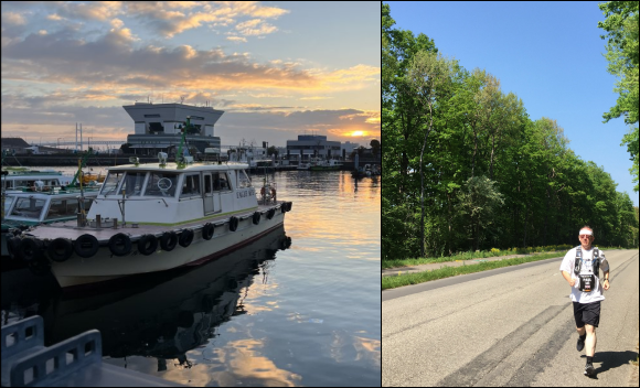 Photographs showing sunrise over the marina in Yokohama. And Paul running on a rural road in France at the back of CERN near Geneva.
In Feb 2024 I visited Yokohama for the first time. I have established some training routes in my adopted home city of Fukuoka, but this year I needed to map out a 10km course in Yokohama. Naturally, I started that by having a look at Google maps. Most of my running is done in central London. And in order to minimise interference (and to stay “in the zone”) I have learnt to follow footpaths by rivers and canals. Fewer road junctions and fewer traffic lights to contend with!
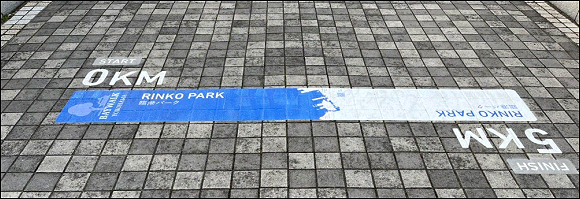
My routes in Fukuoka take me up to the coast line near the Dome (the baseball stadium), and it turns out that my 10km route in Yokohama took me directly to, and then along the coast towards the marina. There’s even a prescribed route marked out on the footpath from Rinko Park to Yamashita Park.
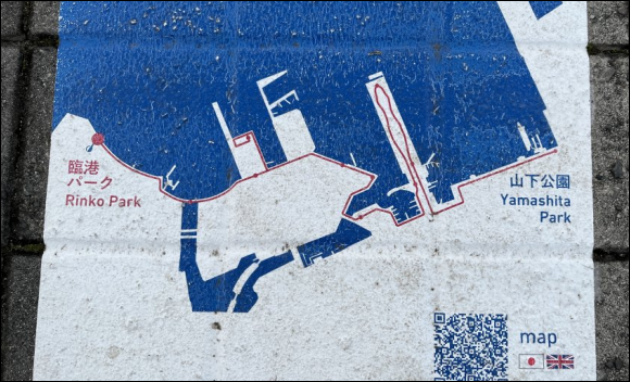
Unfortunately it didn’t fit my plan as I had to cover 2.5km just to get to Rinko Park, and another 2.5km back to the hotel. I covered part of the prescribed course, down to Zō no Hana Park next to Yokohama Marina, and then I headed back again.
I run early in the morning. Up at 5.00am and usually out hitting the pavement around about 6.00am. The official Yokohama coast line route starts in Rinko Park at the Angel Bridge (just visible on the right in this photo), it goes down past the Intercontinental Hotel (the high, bow shaped building) and then off to the marina and beyond.
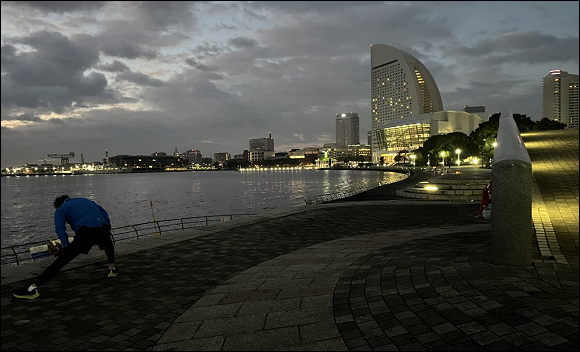
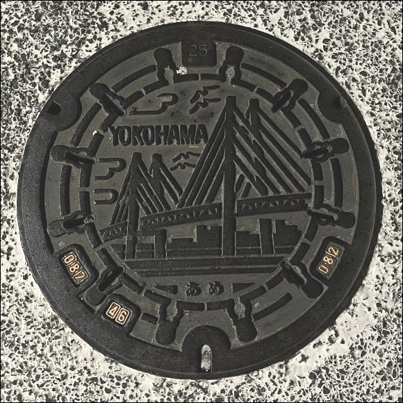
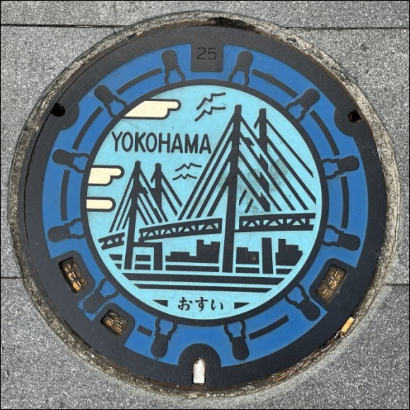
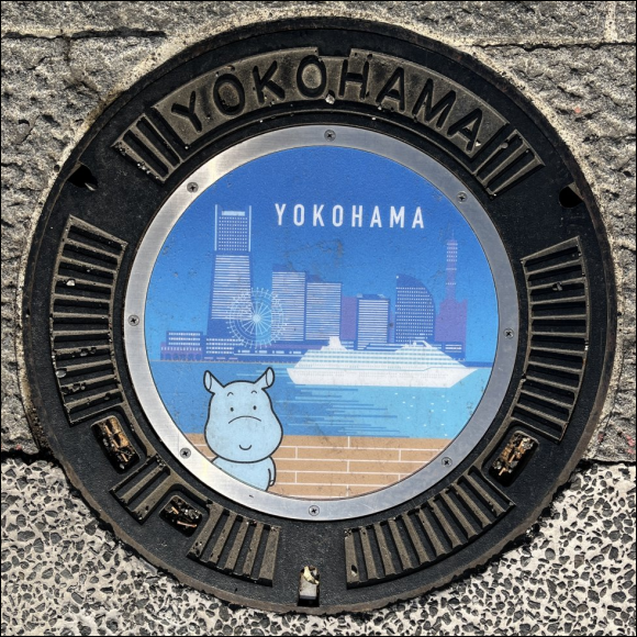
As I passed the military facility at Yokohama Port (in the twilight) I noticed one of the decorative manhole covers that can occasionally be found in Japan. On the way back, with the morning becoming brighter, I noticed a colourful version of the “standard” Yokohama municipal design. Inevitably that meant that I wanted to go back later in the day, get some decent photos, and see if there were any more.
I walked the 5km along my coastline route (taking in the main entrance to the port) and I came back a different way.
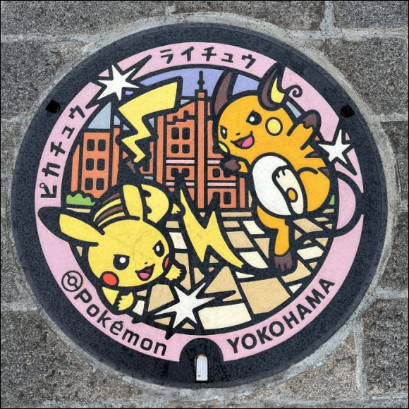
And that was a surprisingly good decision! I stumbled across the Pokemon one!
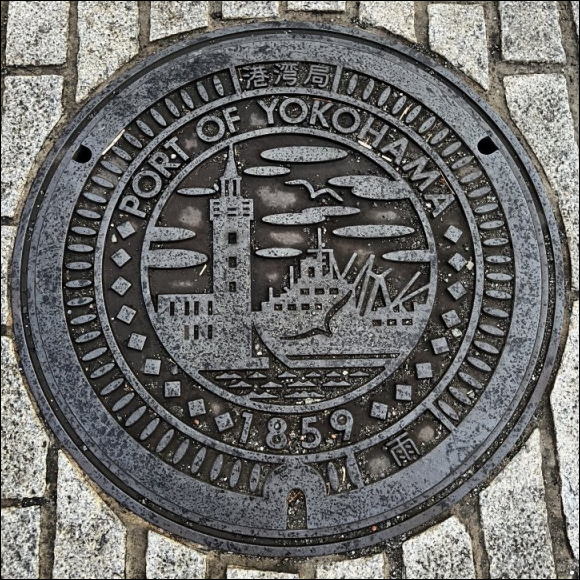
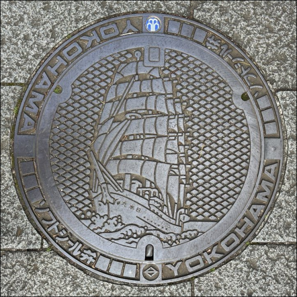
The Japanese Navy has now retired the Nippon Maru, a fully rigged sailing ship, and it sits alongside the quay. And the pavement right next to the ship has its own specially designed manhole cover. This one is probably unique.
Finally, half way back to town (the central station is the centre of Yokohama as far as I’m concerned) I found the Moomin one when I wasn’t even looking for it.
I have seen others in the past. For me, they are a lovely curiosity rather than a passion to be pursued. But for some people, it is a passion! They even have a name for it – an enthusiast is called an operculist.