Matcha is not really green tea!

Early on Sunday morning 29 Dec 2024 I went out for a walk in central London. Instead of going down along the river like I often do, this time I walked to Spitalfields Market. It was early, some traders were busy setting up, the public were few and far between, and there was nothing really open yet.

composite photo - a field of tea busheses with some workers picking leaves - the exterior of a modern Matcha Bar in London

Then, for the first time, I noticed an outlet called “Jenki”. It’s a Matcha bar. It’s a poor imitation of Japan. The word “genki” has a hard “g” as in “get” so why they called the shop “Jenki” I have no idea. As with much Japanese language, the word “genki” is not easy to translate. But Japanese speakers like me know that the word is a blend of “vitality” or “spirited” or “energised”.

More importantly, Japanophiles like me (with dozens of visits to Japan) also know that Matcha is not really green tea. Its colour and its flavour are forced unnaturally.

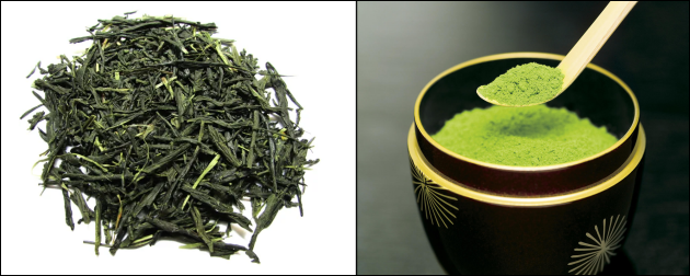
composite photo - dry green tea leaves - powdered matcha

The humble tea bush is largely the same across Asia. If you dry out the leaves, you have the basis for green tea. If you roast the leaves, you can create black tea. That’s basically all there is to it! Green tea from green leaves, and black tea from black leaves.

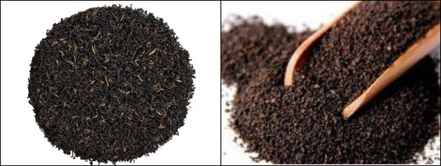
composite photo - dry roasted tea leaves - powdered black tea

Should your tea plantation want to produce more tea more quickly, then there are ways to accelerate nature, and you can make a powder version of green tea. You can also do the same sort of thing with your roasted tea leaves and you can have instant black tea. Coffee beans too! Have you ever seen instant coffee powder? Have you ever seen an “instant coffee powder” shop? One that charges you £4.95 for one cup of Tesco value brand coffee?

composite photo - roasted coffee beans - coffee powder on a spoon - two more spoons with varieties of coffee granules

So the aficionados of Matcha are getting excited about instant green tea in a way that nobody would ever get excited about instant black tea or instant coffee powder!

Matcha tea leaves are grown in the normal way, but about three weeks before harvesting, they are covered in black plastic! That forces the plant to produce more chlorophyll (the green pigment) as it searches vainly for usable sunlight. And that gives Matcha its extra strong flavour, and its unnatural deep green colour. You can also produce more tea from fewer square metres!

composite photo - a field of tea busheses with some workers picking leaves - rows of black poly tunnels covering crops

I don’t like Matcha. I have a feeling that the UK public will eventually tire of it too, because it’s the equivalent of instant black tea or instant coffee powder. And I believe that places like the Jenki Matcha Bar will wither and die in the foreseeable future.

I drink Sencha. And not just any old Sencha, I prefer the better quality brands. Think of it as equivalent to Assam or Darjeeling. I don’t want the Sainsbury version of Assam or Tesco’s own Darjeeling, I want the nice ones from places like Whittard of Chelsea. So I order my Sencha from Hashimoto, a small specialist shop in my adopted home town in Japan.

At High Street outlets in the UK I will settle for an Assam tea from Twinings, or sometimes a simple PG Tips. I have never found a decent green tea on any High Street anywhere in the UK. Whereas in Japan I can get a nice Sencha almost anywhere, and a knowing smile from the staff who understand why I do not drink Matcha! Or Mugicha, or Houjicha!

What does user friendly actually mean?

The term user friendly originated in the days when computers became more widely available. Firstly in the 1960s across bigger businesses, then in the 1970s with the advent of the early personal computers. By the 1980s the concept of user friendly had matured and the desktop computer revolution was in full swing.

It was originally termed human computer interaction (HCI). That had a focus on user interface (UI) design. And it referred to systems or interfaces that are easy for users to understand and interact with.

Nowadays, if you check a dictionary you will find that user friendly is usually defined as an adjective that describes something (such as a product, a system, or an interface) that’s easy to use or to understand.

So user friendly is a term that describes products, interfaces, or systems which are designed with the user’s ease of use and convenience in mind. It’s supposed to signify that the item in question is intuitive, easy to understand and to navigate, and it enables users to accomplish tasks with minimal effort and frustration. Whilst the term came about due to the advent of computers, it can be applied to everything. Think of travelling by roller skate, or pogo stick, or bicycle. Consider boiling an egg by using a campfire, or a gas stove, or a microwave oven.

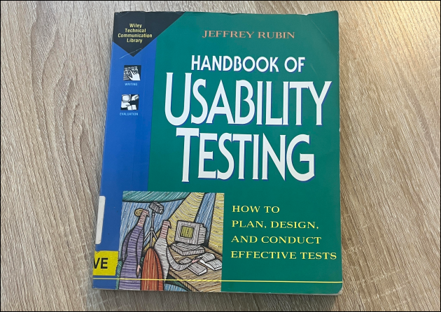
Back in 1994, after 30 years in the field of technology and human computer interaction, Jeffrey Rubin wrote an excellent book entitled “The Handbook of Usability Testing”.

a photo of The Handbook of Usability Testing by Jeffrey Rubin, with a blue and green design on the front cover, sitting on a wood effect desk

http://www.wiley.com/go/usabilitytesting

As early as page 4 he says:

“When a product or service is truly usable, the user can do what he or she wants to do, the way he or she expects to be able to do it, without hindrance, hesitation, or questions.”

If your product or service . . .

• has too many hoops to jump through to even get started; or
• places obstacles in the way of the user; or
• has inadequate documentation; or
• has a bland customer support system which offers nothing but platitudes;

. . . then your users will vote with their feet and walk away.

I recently sold my one year old BMW because I didn’t like the gimmicky dashboard, especially the heater controls. Correspondence with BMW in Farnborough (UK) proved so bad that I wrote to the head office in Munich. Nobody was listening me, and the responses (even from Germany) made it clear that they didn’t care what their customers thought.

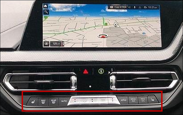
I do not want to take my eyes off the road in order to adjust the ventilation. Particularly in bad, wet weather! If I suddenly want maximum heat and fan directed at the front windscreen, I want to reach for familiar tactile controls which I can operate without looking at them. The BMW arrangement had me looking down repeatedly in bursts of 2 to 5 seconds at a time. On a motorway at 70mph there was no way I was going to take my eyes off the road for the 10 to 20 seconds it needed to fiddle with the touch controls.

part of a 2023 BMW dashboard showing a touch screen computer above a group of small light-touch rocker switches (with very small writing and icons) for controlling ventilation

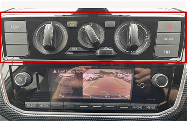
part of a 2023 Volkswagen dashboard showing large rotary ventilation controls of the type which have been common for 40 years - above a modern 4 inch TV screen connected to a reversing camera

I replaced the one year old BMW with a one year old Volkswagen, the last in a line of cars which had tactile controls for ventilation. As a bonus the VW does not have a stupid computer that keeps telling me how I should drive.

For example, I rarely use the radio. It’s always off on short trips. The BMW has an onboard computer that automatically turns the radio on, loudly, and interrupts me with every single travel bulletin. In London in the morning rush hour there are travel bulletins every 10 minutes! Frustratingly, disabling the many unwanted “safety features” has to be done every time the engine is started. There is no global setting that I could invoke once and for all. As I explained to BMW, I want to drive the car, I do not want the car to drive me.

In comparison, my new Volkswagen is a delight. The first time I bought a secondhand VW was in 1982, and I switched later when my wife and I wanted an automatic. In 1998 automatic BMW 3 series were plentiful on the secondhand market, and were cheaper than any automatic Golf. Twenty six years later, and after a succession of 6 BMWs during that time, I am back to buying Volkswagens.

The next time you have issues with something ask the vendor to consider the “no hindrance, no hesitation, no questions” approach to being user friendly. Point them to Jeffrey Rubin’s book.

See what they do. Just talk the talk, or actually walk the walk?

Microsoft Office Optional Connected Experiences Opt Out

I will add more to this when I have time. For now . . .

turn off enhancements in Microsoft Office or you will be sharing everything you write with them

it’s a default opt in – you have to opt out

does the Govt know about this?

the Police?

the armed forces?

your employer?

your students?

your friends and family?

go to

File > Options > Trust Center > Trust Center Settings

Privacy Options > Privacy Settings > uncheck “enable” > OK > OK

restart MS Office

How do you embed fonts in a PDF when using Microsoft Word for self publishing?

I have recently written a book about my third marathon. I started it many years ago in 2017, and it took me a while to complete it. The book, not the marathon! I finished it in 2024.

That means that the Microsoft Word files that I drafted in the old days have been updated regularly, and they have been used over successive years on many different laptops and desktops. Currently I have Word 2019 across all my PCs. Originally my book might have been a Doc file from Office 2003 or possibly even from Office 1997. I have written several books over many years, and I have a habit of cloning older files when I start a newer book. My latest book might have been derived from a document I first made in 1998.

And that’s a problem!

Microsoft Word files are simply a package of data. What we humans see on the screen is not the same thing that a computer sees. My desktop version of Word interprets the data in the file and puts in on screen in a way that I can understand it. However, when Word exports the data to a PDF, and then a book printing computer reads the PDF, it sees something different.

I thought it was all looking good, but when the first proof came back from the printer it looked weird. A mix of fonts, in random places and in random order, sometimes even interupting single words, like “timing” as you can see in the image below. There is nothing in my Word doc to suggest that the fonts were ever changed in these places. Nor is it anything to do with when the dialogue was written or editted.

Here’s an extract from page 45, the Word version is on the left, and the paper version is on the right.

extract from book

I know that you have to embed the fonts in the PDF so that your book printer knows what to do. I thought I had done it all correctly. But it’s not quite as simple as is seems, hence this blogpost.

If you have a text editor (software developers use text editors) you can open the PDF and see what the data actually looks like. The original PDF is on the left, the later PDF with embedded fonts, is on the right.

screenshot of text editor showing normal characters and machine readable characters

The later one shows that the font information is embedded in the file. The peculiar characters you can see are called “raw” and that’s a machine version of the actual text I wrote in the body of my document. It’s the raw data which computers can understand, but humans cannot.

You don’t need a text to editor embed the fonts. You need MS Word (or some word processor which has an export tool) and Adobe Acrobat Reader (or better). My usual PDF viewer is not up to scratch, so I had to use Adobe Acrobat Reader for my final checks.

Your word processor must have an export tool. It’s not enough to print to PDF. That rules out things like CutePDF which I’ve been using for years.

Using various tools, I have noticed that MS Word didn’t always have True Type Fonts. As the next image shows, my legacy Doc file contained fonts such as Times New RomanTimes New Roman and Arial Unicode MS.

screenshot of alert box detailing fonts used

To ensure that your material is print ready follow this lengthy process.

The Process

When exporting from a Word Doc to a PDF there are many, many steps to follow. Don’t ask me why!

In case you have any legacy fonts, firstly (with the document open in Word) set the file options to substitute fonts and convert them permanently. If you have no legacy fonts, then an alternative alert appears to tell you.

File > Options > Advanced > Font Substitution > Convert Permanently > OK > OK

screenshot of font substitution tool

Secondly, set the file options to embed all fonts. You will want to embed everything and not risk systems that misunderstand “only the characters” and misunderstand “common”. So untick “only” and untick “common” and tick “embed”.

File > Options > Save > tick “Embed” > (untick others as required) > OK

screenshot of font embed tool

Thirdly, export from Word to PDF precisely as shown in the image below.

File > Export > Create > (set filename) > Options > tick PDF/A > OK > Publish

And your new PDF will be opened in your default PDF viewer.

screenshot of PDFa generator tool

Fourthly (assuming, that if you’re anything like me, your default PDF viewer is not Adobe) open the new PDF in Adobe Acrobat Reader. Check that you have all of the fonts embedded.

Right click the grey space > Document properties > Fonts > (check, scroll down, check) > OK

Assuming that your check shows what you wanted, then you can be confident that your PDF file is print ready.

screenshot of Adobe Acrobat reader

The Third Marathon is scheduled for publication at the end of 2024.